
You probably know by now that I’m a bit of a data nerd. I am a big believer in analytics and their power to guide online journalists other content curators to make decisions about what is good content. But the data doesn’t always give you the full picture and you have to join the dots. Here is how.
Google Analytics’ greatest strength is also the thing that is most annoying about it: It records everything.
Even a small site with relatively few visitors will have produced useful data, which should start to give you a picture of which people visit your site, why they have come and how they got there.
But what if you need to know something your data can’t tell you, like how well you are serving your clients? Here are a few hints:
- Try looking at your data over a longer time frame. Is there a difference over time in how long people spent on your site, or how many pages they visited?
- Pull up and compare public data from agencies like your own. Governments release information all the time about web visits, and use them to show service delivery in the way we used to measure the number of leaflets handed out.
- Ask sister agencies for their data. Chances are, there is another branch of the business siloed away from you wondering the same things you are. When I worked for gay health agency Healthy Communities, I established a national information-sharing network of web and social media staff so we could all learn from each other.
- Open your ears (and your data) then others will follow suit.
Take an (educated) guess
Data is like the algae in a pond. You can sit back and be mesmerised by its oozing patterns – or you can scoop up a cup of it and swirl it around.
Is a surprisingly large chunk of your traffic going to one particular page? Either it is doing well in search, or it has been referred from something popular (like a prominent social media post). Find out what metrics you need to prove your theory (in this case, search keywords and referring sites) and cross-check.
Most great scientific discoveries are made like this: a scientist with some information has a theory and tests it.
(There are exceptions, of course, like the dude who discovered LSD by accidentally absorbing it. And you said rye bread was boring!)
Think visually
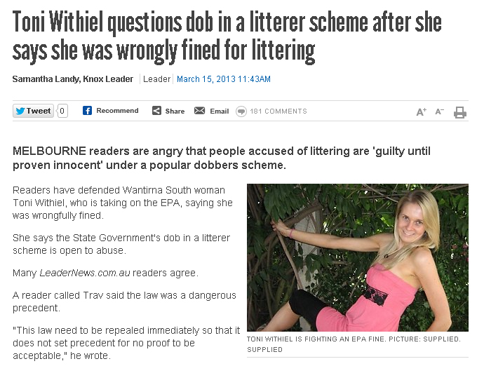
Recently, I published a story for Leader Newspapers about a woman who had taken the authorities to task over someone who had erroneously dobbed her in for littering, resulting in a fine despite there being no proof. The story was sound but the paper did not have the chance to organize a photograph and the yarn ran with a contributed picture of the woman, sitting on a swing.
My instinct from a decade in newspapers was to strip the picture off and use something less incongruous. I was always taught the picture should “talk” to the story and this just looked ridiculous to my mind. However, it was important to show who she was and we had no choice so I left it on the story.
To my great surprise next day, the story performed extremely well in the analytics, all due to the dynamic picture. Thank goodness I questioned my gut reaction!
Much of the reason people click on content – especially news – is due to a compelling picture.
The art of asking
Amanda Palmer advocates the art of asking in her TED talk.
Surveys are a potent way to find out what your audience (or prospective audience) wants from you and how they feel about your content. It’s also a cheap and effective way to canvas ideas. New longform journalism site MATTER did this recently by throwing open its news judgment processes and inviting readers to tell editors which stories they would rather read.
Musician and crowdsourcing fan Amanda Palmer described the art of asking in a recent TEDtalk, saying people want to be asked for help and artists have a responsibility to remain connected to fans by asking what they want.
The ask model also works well when you have very little data, for example if you have a small number of readers and it’s therefore impossible to see patterns of visits.
More on surveys for nonprofits here.
Searching for answers
One of the most powerful insights into what your readers want is to look at what search terms they used to find you. Was it your organisation’s name or rather the services you offer?
If nine out of ten people find your site while searching for one thing, you’d better make sure that thing is right there on your front page.
Which brings me to this guy, and the one great failure of data – it goes one way:

One of the search terms used to find LyndalCairns.com
I dearly wish I could find out who this person was, and whether they found something of what they were looking for on my site.
I want to talk to them over coffee and reassure them I have been there and it’s not hard: you just have to have goals and a clear idea of what you’re doing.
And data. Always check your data.